Tuesday, August 4, 2009

Welcome TINY DIMPLES

What a beautiful design - and what a fun store! It's EVERYTHING BABY at Tiny Dimples. Whether you need a car seat cover, baby apparel, or safe toys - even nursery decor and bedding - Tiny Dimples has it. If you're having a baby, or know someone who is - they've got what you need for the perfect baby gift.

This was a great client, who knew what she wanted - and the site turned out great in my opinion. She's got a knack for carrying the right products, organized them properly, and also displayed them with a common theme and branding throughout the site. The site is usable, easy on the eyes, and packed of products to choose from.

Speaking of babies......

It hasn't been too long since I had my first baby, he'll be three September 1st. We just had a positive experience getting off the pacifier that I'd like to share with you guys - (if you're interested in something off the beaten path of websites and such.)


He'd had it the entire time - that is, the pacifier. The pacie, as he called it was a staple of all events - eating, sleeping, car, school. He was attached. Any mom whose kiddo is on the pacifier kinows this is a tough habit to break. Everyone said to try and cut off the end - that didn't work. Others said to try dipping it in vinegar or hot sauce. Now my kid loves salsa. (hot salsa too.)

He'd gotten pretty good about giving it up during the day, but night time was terrible - and the pacie was a must to get him to sleep and keep him that way.

One morning - right before his typical time to wake up - I looked at him as he slept. I thought to myself, "wouldn't it be great to lose this pacifier today?"

So, I reached down and unplugged it from my child while he was asleep. Just like that. Threw it in the garbage.

Then, I grabbed a prize, and ran back in to him.

A few moments later, he was waking up - and I was THERE. Of course, little hands feeling around for his small rubbery friend that was now in the kitchen trash can.

When he opened his eyes and began to ask me, I cut him off and said (loudly and excitedly) "WOW - You didn't have the pacie ALL NIGHT! What a BIG BOY! You get a surprise today for NOT having the pacie all night!" and I presented him with a dollar-store book.

He was a bit confused, but happy to get a surprise nonetheless, and when I just kept on about what a big boy he was - making a HUGE deal of the occassion, (calling in Dad to woo him on the event, calling the Gaga to tell her, and Aunt Kimmy) - he smiled and looked a little proud.

I told him that each night he went without it we'd give him another surprise in the morning.

This went on for about a week. Seven dollars later - we're paci-free.

Enjoy your babies, your blogs, and your websites - until next time!

Monday, July 20, 2009

Seriously - Why Are You A Table Hater?

I still use them. A lot. In fact, most of the time.

I really want to know what the big problem with HTML tables REALLY is - so this is the first time I'm ASKING for you to comment here. I just want some feedback and opinions from you guys out there - but if you're going to call me an HTML-Loser or scold me for utilizing HTML tables still - just know - I'll NOT PUBLISH YOUR COMMENT!! So, be nice and helpful, please. :)

OK, so onto the discussion going on in my brain.

Yeah, yeah... I know - a pure CSS layout that's totally fluid, accessible, W3C Valid, splash page-free, hydromatic & systematic, turbo-fueled, vegan, eco-friendly and sugar-free website is all the rage... But SERIOUSLY - are tables REALLY that bad?

I think there's some great things about tables.

For starters - I feel like I have absolutely more design control over tables. I set the size, and right from the start - I know EXACTLY how large my accompanying graphics should be. I find with design work for Volusion E-Commerce, I prefer customizing a fixed-width table template rather than the fluid ones. The main reason for this, is that once the 'core design' is in place, the client or store owner almost always wants a main page graphic that is either in Flash, or clickable to different areas of the site (for example - we did this on the Medical Department Store, and Mom's Gift Shop - if you view the front pages, you'll see heavily graphic landing areas). If these were fluid layouts - then our static graphics would be dwarfed in large browsers. Am I wrong? Is there something I'm missing here?

How do you guys that create fluid 100% width websites manage to have center front page content or design elements that 'fit' well in 'most' browsers and screen resolutions?

Am I just a control freak? Is it that tables are just plain easier to create and work with?

OK, so now you're saying - "just build your site in fixed width DIVs if you want fixed width..."

BUT WHY? Or, I should say - WHY NOT just do it with tables? What's so wrong with tables?

Maybe it's my brain, or maybe it's just that I stick with how I learned - but tables click in my brain better than divs. They always have. Maybe it's just that I am stuck on tables.

Maybe there is a 12-step Get-Away-From-HTML-Tables program I need to start.

Are there any of you like me out there? Or am I totally alone? Offer feedback, just don't hurt my feelings, OK?

Don't get me wrong: I use divs all the time - and use them WITH tables. I have a few sites that are table-less, and honestly, I'm no more proud of them than I am the ones that are table-ridden.

I'm not a table hater. I'm still a lover.

Sunday, July 12, 2009

New E-Commerce Websites And Designs

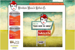
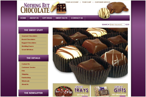
Welcoming two new e-commerce designs to the internet: Mountain Mama's Soy Candles in a Can - and Nothing But Chocolate!

Mountain Mama's Kitchen creates YUMMY soy candles in-a-can featuring Hand-poured, cotton wick, lead-free DOUBLE scented candles! With fascinatingly creative titles - such as Elk-Poop In A Can (which is really chocolate Biscotti) and Trailer Trash In-A-Can - you can't go wrong with these for your own personal stash of good-smelling things, or for a great gift.


Also welcoming Nothing But Chocolate - and their name leaves NOTHING But CRAVINGS to the imagination. Each order produced in small batches - hand made fresh for each order. Perfect for special occasions such as weddings, baby showers, holiday events and more - The owners of Nothing But Chocolate will work with you one-on-one to create the perfect sweet nothings for your event or taste, and they make a great party favor.


Once again - I have to say - we're so pleased to be able to help small businesses (and large ones too!) bring their vision online. With E-Commerce template designs, in so many cases - we find that store owners don't feel that their 'personality' and vision come through in their design. We try really hard to see your vision, and make it come to life online.

Welcome to the web to all the new clients we're working on - and may your new store flourish - we know you'll both do great!


Wednesday, July 8, 2009

Why not feel like a “super-hero”?


Kari and Company recently had the wonderful opportunity to work with a new company selling hot and cool product: FLY JUMPERS!

Fly Jumper Canada is an authorized reseller for the Fly Jumper brand of jumping stilts and accessories in Canada.

We didn't know it - but the claim is that you can you jump six feet in the air and run almost twenty miles per hour wearing jumping stilts! Surely, by now you have heard of them (or if you've seen "Jackass" the Movie...) and if you haven’t - welcome to the world of a new and exciting way to exercise and have fun all at the same time! This Canadian based company is also trying to develop and inform people of the sport of Powerbocking.

Some describe Fly Jumper Stilts as “spring loaded jumping boots” or “jumping stilts”. You can purchase different ones for your weight and also get one for your kiddo! Kids as young as 10 years old are also enjoying the Fly Jumper fun. Families are improving their fitness level together, having fun instead of watching TV all day and playing video games!

This looks like great fun for the family and is very affordable.

Kari and Company is pleased to have had the opportunity to help them with their e-commerce template design.

Thursday, July 2, 2009

Congratulations to Ali's Cookie (Shipacookie.com)!!

CONGRATS to our client Ali's Cookies!


Ali’s cookies (also known as shipacookie.com) has been online now only for a little over a year, but is already being spotlighted by those with a taste for gourmet cookies! Their homemade goodness will be the audience delight on the Rachel Ray show tomorrow, Friday July 3, 2009. They will be the featured “snack of the day” showcasing their exclusive Choco Choco Chunk Cookies.

Ali's Cookies are baked fresh (seriously! from scratch!) daily, and are certified Kosher. They focus on the cookie, and the taste - not just the packaging; adhering to the strict standards of a kosher bakery - all treats are made with the best and freshest ingredients like real vanilla, fresh cracked eggs and sweet creamery butter. There are no preservatives added - and they even hand scoop the cookies to give them extra effect for that 'homemade look'. Once you've eaten them, though - it doesn't matter that they looked homemade - you KNOW they are. (or - in our case, were.)

Alison & Jeff Rosengarten are the owners of Ali’s Cookies and their recipes have been passed down through the family for years. They have been baking wonderful cookies since 1981 - and have been in the press several times.

Need a gift? Try Shipacookie.com for a neat, unique and scrumptious gift!

I bought a photo cookie cake for my husband last year - and was delighted with the prompt and personal service -the precious cookie we received - and we absolutley enjoyed the thick, chewy, chocolately goodness - icing and flavor that came with it. It's a great gift.


Wednesday, July 1, 2009

E-Commerce Suggestions From Kari & Company

So many of our clients come to us and say - "I'm not sure where to start" - we always try to help our clients along the way and offer suggestions based on their needs.

Of all the issues that arise during the process of designing an e-commerce template or website - we find that the products, features or promotions aren't always 'in your face' front-and-center of the store in a way that entices the potential customer to want to buy. So when you work with us - we will usually make suggestions like these - we want to share them with you now:

1/ Say who you are on your homepage: From the moment someone hits your site - they should know what you're about. Steve Krug's book - Don't Make Me Think - is a great primer to this concept. Sure, the book is a few years old - but the idea is forever. Your potential client doesn't want to click for days to find your products or what they need. They want to be in control; and know where they are. Say who you are and give them options RIGHT FROM THE START!

2/ Offer standard layout when you can: Store owners don't always like the standard layouts - horizontal navigation, side menus, etc - and want something different and unique. But the truth is - standard layout is what your user expects. They EXPECT to see your logo and branding top left. They EXPECT to see horizontal and/or left-side navigation so they can find what they are looking for - categorized in an intuitive way.

3/ Treat it like a REAL STORE: Store owners of e-commerce sites often think that what they are doing is totally different from owning a brick and mortar storefront. Really, it's not. E-commerce site owners have to prepare 'virtual endcaps' with great promotions, graphics and displays in and around their site, have 'point of purchase displays' throughout the shopping process to incent your client to click around, and showcase their product and/or services in a creative way.

4/ Keep it clean and fresh through design: Certainly - the end-user experience should be an aesthetic one; one that looks and feels nice. This creates a sense of security - a nicely designed website will give your client a feeling that they're buying from someone who cares enough about their store to keep it nice.

TIP: "Splash pages" are officially out. Just so you know. I still get people ask for these all the time. While they're cool - and pretty - it's an extra click for your client! People tell me all the time - "I leave a website that has one of those intro pages....." Now, if you really want one - I can make you a darn pretty one. Even a Flash one (which are more annoying to users than the static ones...) But don't be surprised if I try to talk you out of it - because I don't want you to lose visitors. :)

That's about it for now. Certainly each design or project has it's own needs - and we try to customize your results based on your vision and needs. Happy Surfing!

Monday, June 8, 2009

Virgina Tech Fans UNITE

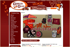
We recently completed a really fun website design for Volsuion e-commerce - called Gobbler Gear!

If you're a Virginia Tech fan, look no further than Gobbler Gear for Virginia Tech branded apparel, Virginia Tech Hokie Gifts, VT Flags and Banners, and Hokie Collectibles!

These guys are serious about Virginia Tech - as a web designer, I am so thankful they came to us with hexidecimal color codes for the proper Hokie color scheme, information on what we could and couldn't use with regard to the VT Mascot and logo - we were able to get to their design much faster with the information they provided us. Thanks to all at Gobbler Gear for a great website design experience - may you have many customers and sales with your new online store!

AND - We just heard - Gobbler Gear will also have a physical storefront near the Virginia Tech campus! Congrats on all your growth!

Learn more on their website at www.gobblergear.com.

Sunday, May 17, 2009

Expanding Services - New E-Commerce Design Platforms Availalb


Well, I'm pretty proud of myself over here - I taught myself how to customize 2 new carts this week. How's that for expanding horizons? :)

I really love it when we take time to figure out how something works - and help someone out - and such was the case in all three of these instances.

While I already had some experience with Core Commerce - (One website - Camo Supply - online boutique carrying hunting, fishing gear and more) and have an opportunity to work on another one right now. This one's cool - it's CANADIAN - and you know how I love those Canadians -( the guys at Attribune )- they helped me with that horrible virus last year. And - this new Core Commerce site sells a really cool product.
Also, helped a colleague with a Channel Advisor store - which once it's live - is going to be GORGEOUS. Can't wait to post a link to it.

Also, customized a very cool E-Bay Company Pro-Stores site. I'll post a link as soon as it's live - but it looks great so far!

I will be adding these services to my schedule of services - likely at the same price as Volusion customization. I haven't completely decided yet, because the features and flexibility of each are so different - it might take doing a few before I really know how much time it will take.