Have you ever thought, “That’s the ugliest, most confusing web site I’ve seen to date...” and just couldn’t hit the exit button fast enough? Thinking to yourself – “Ugly…Ugly…Ugly - those colors are awful, and that music didn’t make it any better, what were they thinking when they created this?” Sure you have. One has to wonder if the web designer is creating the site design based on their client’s preferences on color, style, and content – or if the web designer is just not using instinct and experience on what will work for a web site depending on it’s audience, and needed functionality. If it’s the first case scenario, then the old saying “the customer is always right” should not apply to web design!
Leaving some of the design to the professionals (based on your inspiration and style, of course...) can result in more targeted traffic, and wider exposure and hopefully ‘actionable’ items – that is, graphics and keywords to entice your clients to CLICK around, and BUY your things! The pros have the insight and imagination to create a web site that showcases your particular product or service – and hopefully from your online buyer’s point of view.
It’s always good to keep your viewer’s interest, entertain them a bit – and lure them into wanting to know and see more of your web site. And as always - navigation should be clear and consistent; user friendly and ‘brain pleasing’. We please the brain by not making it do too much work. 'Effortless' is a good word here...
Designers listen to and work with their clients to produce a website that is pleasing to them (as site owners) and looks how they envisioned; but in turn – clients of web design services need to remember to trust in their designer’s suggestions and their talent & experience for being able to see the overall picture.
Of course, not every suggestion or idea is going to be accepted or workable – we know this. However, there are some of us out there who are truly interested in helping your company be a success on the internet – and we don’t just say things to complicate the process, rather, we hope that we’re sharing valuable information with you that will help you have more success on the growing and changing internet.
And - we don't know everything there is to know about your product or service. We NEED your input and feedback along the way to get to a design that works for you (and for your audience!) - and produces good results where accessiblity, functionality and overall look and feel are concerned.
Just like art – web design is subjective. What we like as individuals is not always as pleasing to our neighbor’s eyes, and when you are on stage to the whole world (wide web) don’t you want to put your best foot forward?
So, keep an open mind with your next web design project, and find a designer (hopefully US!) who will work with you to achieve your goals, see your vision and keep your audience interested!

Showing posts with label ARTicles. Show all posts
Showing posts with label ARTicles. Show all posts
Tuesday, August 18, 2009
Monday, July 20, 2009
Seriously - Why Are You A Table Hater?
I still use them. A lot. In fact, most of the time.
I really want to know what the big problem with HTML tables REALLY is - so this is the first time I'm ASKING for you to comment here. I just want some feedback and opinions from you guys out there - but if you're going to call me an HTML-Loser or scold me for utilizing HTML tables still - just know - I'll NOT PUBLISH YOUR COMMENT!! So, be nice and helpful, please. :)
OK, so onto the discussion going on in my brain.
Yeah, yeah... I know - a pure CSS layout that's totally fluid, accessible, W3C Valid, splash page-free, hydromatic & systematic, turbo-fueled, vegan, eco-friendly and sugar-free website is all the rage... But SERIOUSLY - are tables REALLY that bad?
I think there's some great things about tables.
For starters - I feel like I have absolutely more design control over tables. I set the size, and right from the start - I know EXACTLY how large my accompanying graphics should be. I find with design work for Volusion E-Commerce, I prefer customizing a fixed-width table template rather than the fluid ones. The main reason for this, is that once the 'core design' is in place, the client or store owner almost always wants a main page graphic that is either in Flash, or clickable to different areas of the site (for example - we did this on the Medical Department Store, and Mom's Gift Shop - if you view the front pages, you'll see heavily graphic landing areas). If these were fluid layouts - then our static graphics would be dwarfed in large browsers. Am I wrong? Is there something I'm missing here?
How do you guys that create fluid 100% width websites manage to have center front page content or design elements that 'fit' well in 'most' browsers and screen resolutions?
Am I just a control freak? Is it that tables are just plain easier to create and work with?
OK, so now you're saying - "just build your site in fixed width DIVs if you want fixed width..."
BUT WHY? Or, I should say - WHY NOT just do it with tables? What's so wrong with tables?
Maybe it's my brain, or maybe it's just that I stick with how I learned - but tables click in my brain better than divs. They always have. Maybe it's just that I am stuck on tables.
Maybe there is a 12-step Get-Away-From-HTML-Tables program I need to start.
Are there any of you like me out there? Or am I totally alone? Offer feedback, just don't hurt my feelings, OK?
Don't get me wrong: I use divs all the time - and use them WITH tables. I have a few sites that are table-less, and honestly, I'm no more proud of them than I am the ones that are table-ridden.
I'm not a table hater. I'm still a lover.
Monday, June 8, 2009
Virgina Tech Fans UNITE
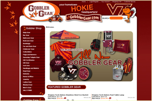 We recently completed a really fun website design for Volsuion e-commerce - called Gobbler Gear!
If you're a Virginia Tech fan, look no further than Gobbler Gear for Virginia Tech branded apparel, Virginia Tech Hokie Gifts, VT Flags and Banners, and Hokie Collectibles!
These guys are serious about Virginia Tech - as a web designer, I am so thankful they came to us with hexidecimal color codes for the proper Hokie color scheme, information on what we could and couldn't use with regard to the VT Mascot and logo - we were able to get to their design much faster with the information they provided us. Thanks to all at Gobbler Gear for a great website design experience - may you have many customers and sales with your new online store!
AND - We just heard - Gobbler Gear will also have a physical storefront near the Virginia Tech campus! Congrats on all your growth!
Learn more on their website at www.gobblergear.com.
Tuesday, July 15, 2008
Adding GREAT BIG PHOTOS to your blog.

HOW TO ADD GREAT BIG PHOTOS TO YOUR BLOGGER BLOG
For many of my photographer clients, they showcase their work on their blogs. THIS is a magnificent idea!!
However, they always ask - "How can I get the photos larger on my blog"?
Well, first - the template used has to be widened to a accommodate such large images, then the images need to be inserted, and the HTML edited to the exact size of the photo.
SO first: the template must be customized a bit to widen it. (usually) This blog is set to 100% width. A fixed width is great too, as long as the main posting area has at least 600 pixels or so of working post space. 600 pixels is a good width, anyway for blog photos (as far as big ones go) and should fill the area nicely. The example above is 600 pixels wide, and 450 pixels high.
Then, the images must already be hosted somewhere (that is, not uploaded directly to Blogger in the post, but already existing on the web, having been uploaded via FTP to your hosting account, or already existing in it's largest or full size on a photo sharing website.
Why can't you just upload them? Because Blogger stores your photos on Picasa, which resizes them to the default 'S, M & L' settings (I believe 'large' is 400 pixels max width). There's only three sizes (S, M & L) when uploading to Blogger. If you try to go in and edit the HTML, it will then enlarge an already downsized image, making it pixelize. So to retain image quality, it's best to have them hosted.
SO - upload your images somewhere (and know their exact height and width) via FTP to your website, or a shared photo community (like your own Picasa account, or Photobucket). Then, you'll right click the photo in it's full size, and get the URL to the image. The URL to this image is http://www.kariandco.com/great.jpg.
Then, insert photo into your post as normal, but use the right side option, to add it from the URL. Paste in your URL to the photo. Go ahead and select "Large", and then your orientation (left, right or center).
Once it's 'done' and inserted, you'll see Blogger resized it (to 400 in my case..) so you'll need to now edit the HTML. Click the 'Edit Html' tab in your post.
At the top, you'll see the mumbo-jumbo that was auto-created when you inserted your image. You now need to manually add the height and width of your image to the CSS statement that controls the image and how it displays. Here's the code, and what you'll add/change:
Part of Original Generated Code:
........img style="margin: 0px auto 10px; display: block; text-align: center; cursor: pointer; width: 400px;" src="http://www.kariandco.com/great.jpg" alt="".........
(see? it resized the width to 400px...)
So now, update your code (just type in your height and width, using the exact styling as below):
........img style="margin: 0px auto 10px; display: block; text-align: center; cursor: pointer; width: 600px; height: 450px;" src="http://www.kariandco.com/great.jpg" alt="".........
And VOILA! - you've got larger photos on your photo blog!
Hope this helps you photographers out there!
Wednesday, December 5, 2007
Monday, December 3, 2007
E-Commerce Solutions
Need to sell your stuff online? There's so many options available, I thought I'd share some of my experience.
Depending on:
1/How many products you have to sell
2/Your budget
3/Your hosting arrangements (do you already have a website hosted?)
4/Your reporting and management needs
I have several systems that I've worked with now, that I can categorize to best make a suggestion to how you should choose.
If you are looking for great reporting and support, as well as a hosted solution (that is, you don't have a dedicated host for your website), I highly recommend Volusion, a hosted e-commerce solution that is fully customizable, with GREAT support, and GREAT reporting. With Volusion, you'll pay for hosting, and (maybe) your domain, and you can also sign up for a SSL certificate (Secure Socket Layer) and a merchant account + gateway (to accept credit card payments) all in one swoop. With this solution, you'll choose different packages depending on how many products you sell.
If you already have a hosting account, and you're on a tighter budget, you can always opt for an Open Source (Free, under the GPL License) product like Zen Cart, or OS Commerce. Another option, is to go with a CMS (Content Management System) like Joomla, and install a shopping cart component to go with it, like Virtue Mart. All of these options are 'free', but since they are so, the support is more of a 'community' of people who work with these applications. While they all work great, once installed and configured, they do require a little more learning on your part, as the end user. They are also customizable with template structure, and can be managed by you.
There are thousands of other applications and programs out there, but these, so far - have proven the most efficient for managing and selling products. If you can afford to go Volusion - I do recommend it highly because of their awesome support staff.
Please don't hesitate to contact us with any questions or concerns - we'll be happy to be candid with our experiences in this arena.
Happy Selling!
Subscribe to:
Posts (Atom)